Overview
My Pathlight is the 1st in-house property management mobile app in Home Partners of America, a Blackstone subsidiary. The product was initiated by me and a couple of project managers in response to the rising interest rates and dwindling property acquisition growth. Since Q3 2022, this product has been one of the top priorities for the company, and it has continued to contribute to stabilize rent collection rates, reduce service expenses, and increase customer satisfaction.
My Role
Senior Product Designer. Collaborative Workshop Host.
Led and worked on the design from 0 to 1 and feature expansions.
Tools
Figma, FigJam, Teams, Excel
Scope
9 Months
Key Outcomes from My Pathlight Property Mobile App
💰 40% Decrease in misdirected service queries
💰 32% Annual cost savings on the subscription fee
💰 13% Operation cost reduction
🏆 95.7% Mobile app adoption rate
⬆️ 22% Increase in annual rent collection
⬆️ 10 points improvement on brand NPS
How It Started
The Problem
In Q1 2022, facing slowed growth due to rising interest rates, Home Partners of America shifted focus from property acquisition to operational improvement, prompting leadership to collect proposals aligned with this new direction.
The Goal
In response to the enterprise's pivotal strategy, the product manager, VP of the product team, and I proposed building a property management mobile app. This app, in addition to the existing resident desktop portal, aims to:
Stabilize rent collection rates by providing a more accessible payment method.
Reduce service expenses through in-house digital solution development.
Increase customer satisfaction by enhancing accessibility and usability.
The desktop portal was the sole resident property management tool back in Q1 2022.
Leadership approved our proposal of building an in-house property management mobile app on the condition that we would need to provide quantitative success validation within 3.5 months for the company’s full commitment to product development.
Project 1 : Validating MVP Success in 3.5 Months
Due to the tight timeline, our solution is to design and release an MVP version.
Challenge:
Plan and design realistic yet impactful deliverables
Team: Me + 1 Product Manager + 1 Offshore UI Designer
My Role: Planning + Wireframing + Testing
For planning, I collaborated with the PM. Together we defined the MVP launch scope of the following:
Focus on frequently used features and direct residents outside the app for less common or technically complex features.
1400 households, about 5% of the total households at the time, participated in the soft launch, which is an industry-standard.
According to the Power BI report, the top three most frequently used functions were payment, maintenance tracking, and contact us. For other features, users were directed to the desktop portal to complete their desired actions.
The design flow and style mirrored those of the existing resident desktop portal.
1 Month Post MVP Release…
Although the MVP fell short of user expectations, we received the green light from leadership for full development due to the high adoption rate of 68%.
We launched the MVP version in Q3 2022 and conducted user interviews and data reviews. We learned the app fell short of user expectations in terms of visual presentation and usability. Despite this, highlights include a decent adoption rate of 68% within just one month of launch.
Enhancement Examples
Conclusion:
Users expect an all-in-one mobile app for all their property management needs.
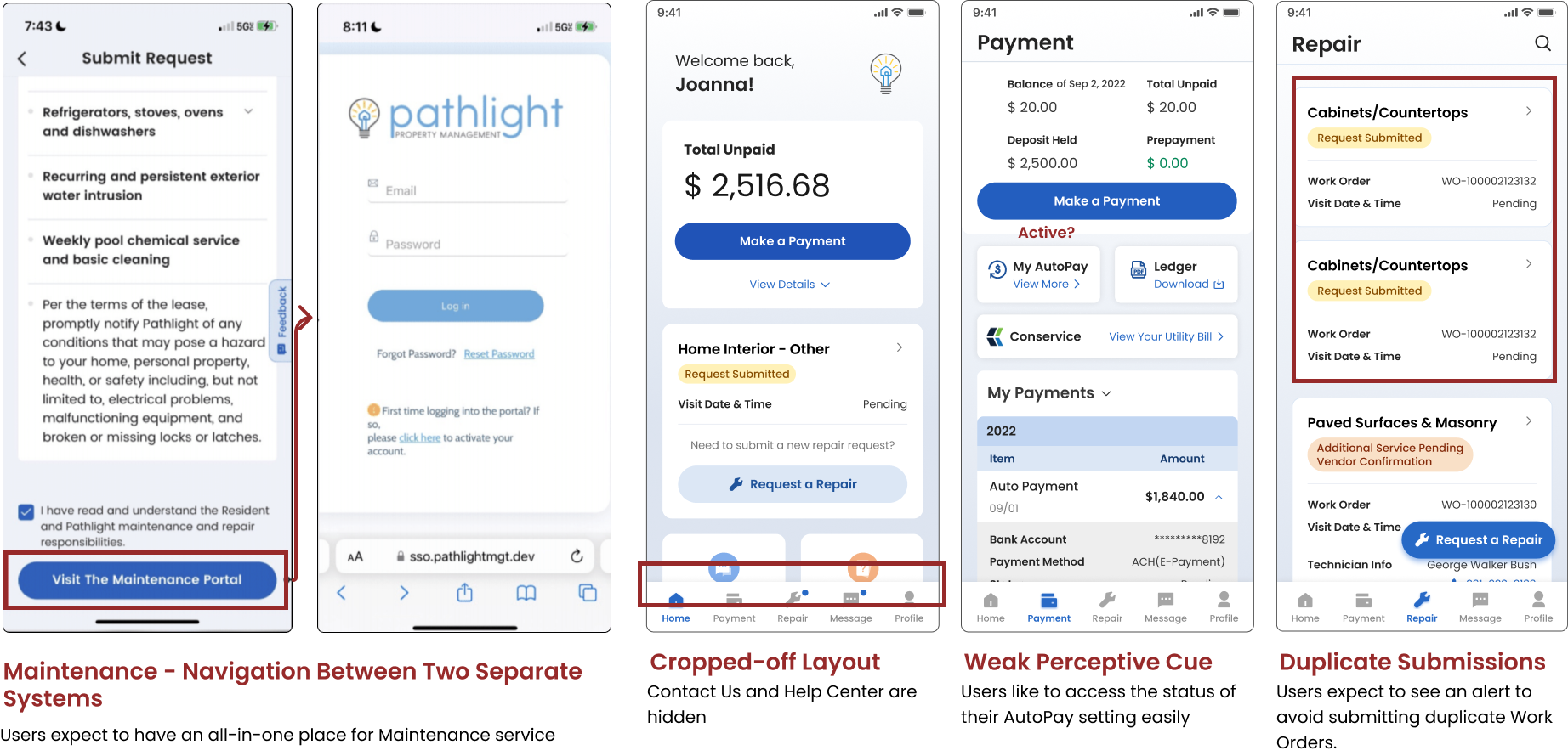
The concept property management mobile app aligns with residents' expectations and existing behaviors, but falls short due to a lack of functionalities and unintuitive design.
Some interview screenshots
from Userlytics
Project 2: Acquire Support from Cross-Functional Teams to Build the All-in-One Platform
To ask for support, we need to first align our knowledge. This means understanding the goals are trying to achieve, challenges we are facing, and actions we can take.
Challenge:
Adjust stakeholders’ concerns and highlight opportunities to contribute to OKRs.
Team: Me + 1 Product Manager
My Role: Workshop Hosting + Benchmark Establishing
Duration: 3 weeks
To do this in the remote work setting, I decided the best way would be to host a collaborative workshop in FigJam. This allowed me to host discussions with the product manager, marketing members, business stakeholders, and the dev team at the same time. Having all these members we can ensure any idea we come up with is feasible, impactful, and contributes to the enterprise goal.
Here are the top 3 pain points and top 3 final solutions we identified:
💡 Top Solutions
😞 Top Pain Points
Revamp UX/UI
In-house maintenance intake creation
Autopay enhancements & promotions
Product identity gap
High vendor subscription costs
Unstable rent collection
“ You Can’t Manage What You Can’t Measure. ”
– Peter Drucker
To effectively implement the solutions we identified, I organized a follow-up workshop where we divided our solutions into three phases. We then broke each solution into smaller tasks and assigned team members to each task.
I created a benchmark to ensure every initiative aligns with enterprise goals and yields tangible results; contributing to stabilizing rent collection, decreasing expenses, and increasing customer satisfaction.
After all this prep work, now we are ready to tackle the first solution of revamp app & portal UX/UI
Project 3: Revamp UX/UI
Challenges:
Establish a strong product identity, and
Surface the right feature at the right time
Team: Me + 1 Junior Designer
My Role: Planning + Research + Design System Building + Wireframing
Duration: 3 months
Product Identity Inspirations
My contribution as a lead researcher:
Conducted task, audit, Pluses & Deltas research on all apps
Highlighted features that met user needs
Integrated findings into design planning
Airbnb, Slowly, Waze, Uber, Spotify
Synthesizing method
I walked through each app and marked elements that contribute to a strong product identity creation, then converted findings into design recommendations.
Scalable Design System Building
From these key takeaways on the UI side, the junior designer and I created a scalable design system, consisting of:
Color palettes
Typographies
Buttons
Components
Graphics library
My contribution includes:
Planning
Building out the foundations
Creating examples for the junior designer to follow
Surfacing the right feature at the right time.
Card Sorting – Ensure information architecture aligns with residents’ expectations
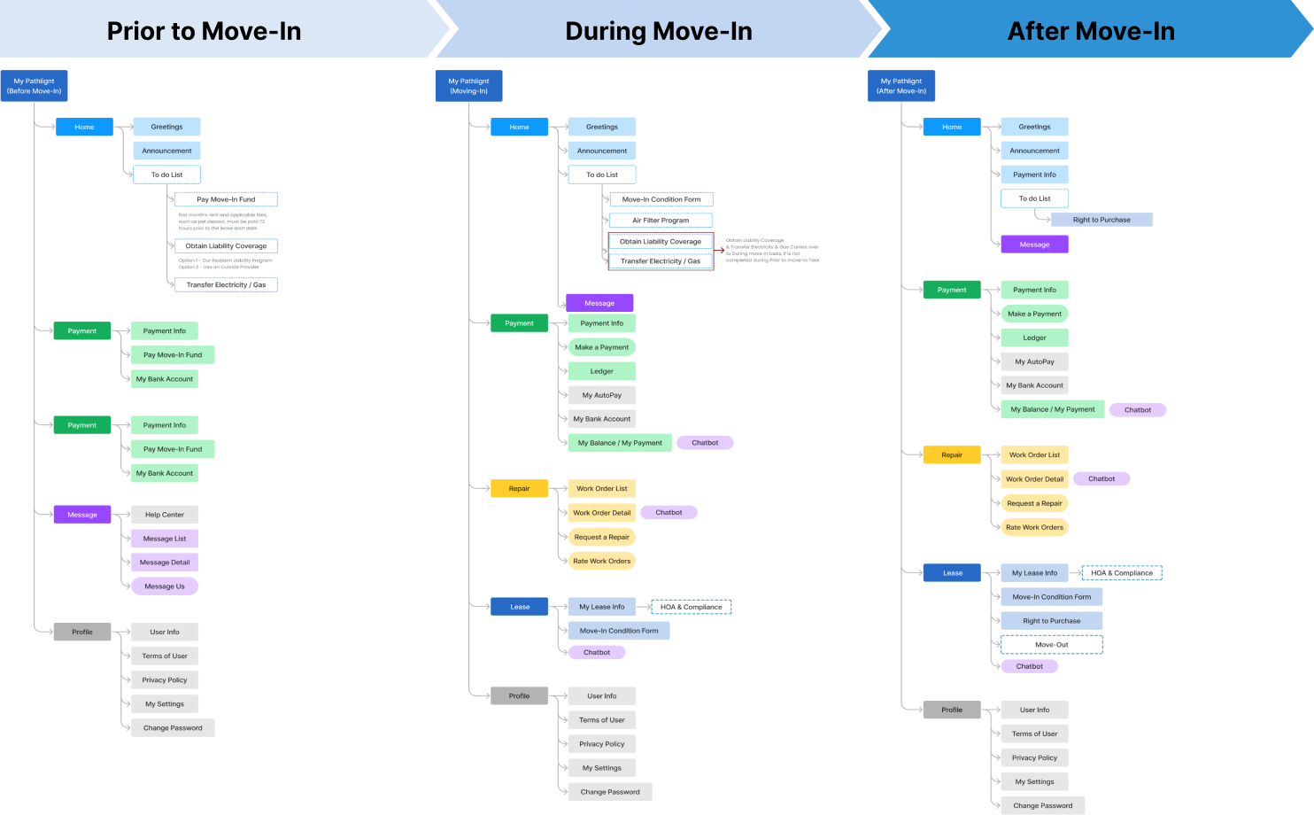
I conducted multiple Hybrid Card Sorting exercises using Userlytics. This involved listing the most frequently visited modules (homepage, payment, profile, repair, my lease, and messages) as main categories and auditing all existing sub-features within each module as cards.
Key takeaways :
Residents expect to see shortcuts on frequently used functions on the homepage.
Residents expect only to see information associated with them under the profile.
Residents think the profile is secondary information compared to others.
Certain features need to be accessible in multiple locations.
Solution
Integrate Hybrid Card Sorting findings to accommodate resident app journey
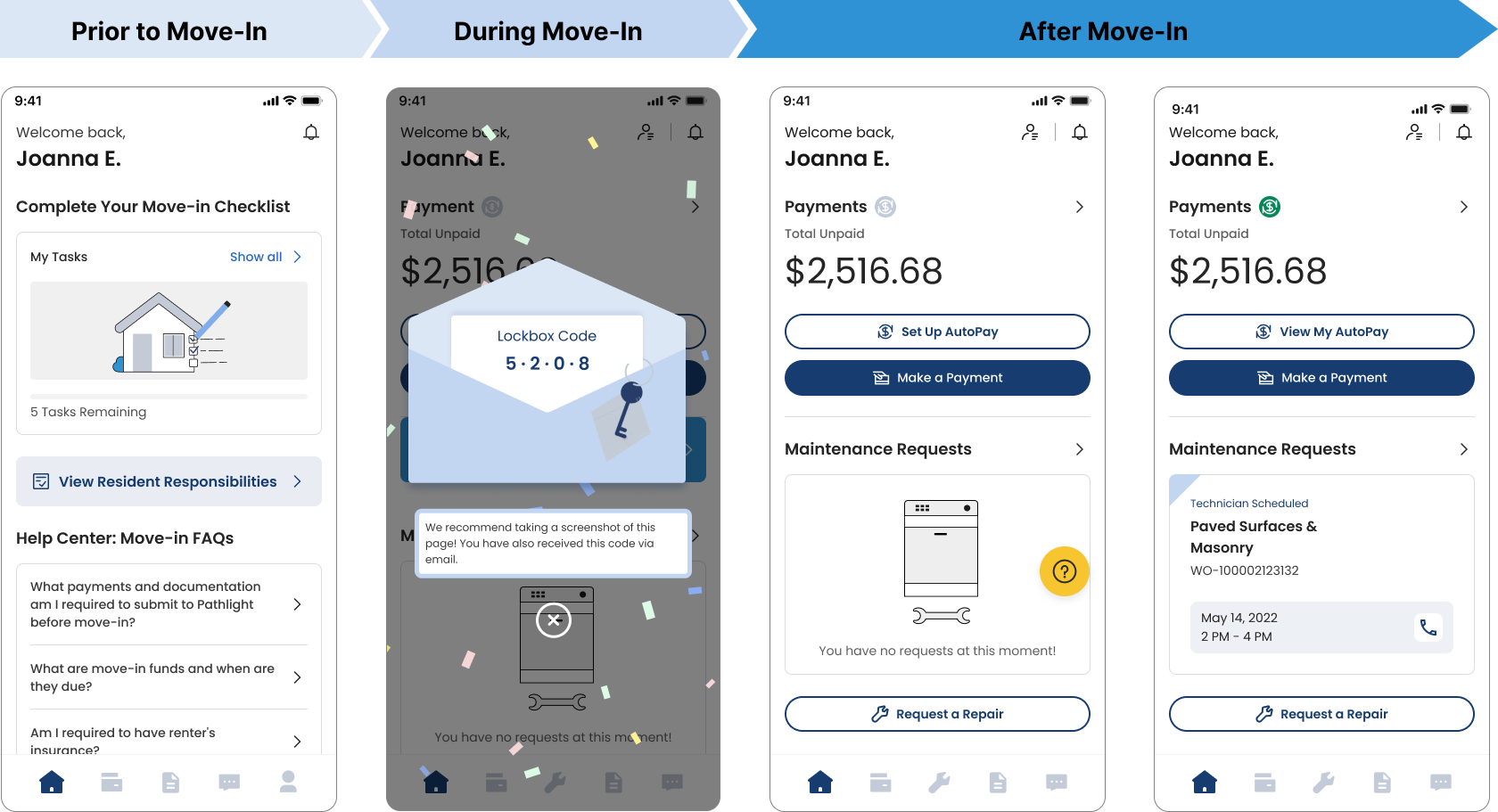
Example: Homepage adjusts to accommodate different residency statuses
The move-in to-do list is prioritized during pre-move-in.
A welcome confetti is displayed on the move-in day.
Payment and maintenance features are emphasized after move-in.
We adopted the same UX/UI strategy on the desktop portal side and leveraged the portal to further push the app adoption rate.
Revamped Resident Portal
1 Month After Revamped UX/UI Full Release…
The app's version met overall user expectations, increasing the adoption rate to from 68% to 87.7 %.
However, ease of use is slightly lower, primarily due to the maintenance module. Residents were still directed elsewhere to submit maintenance requests.
The above finding aligned with the teams’ expectation, which led to our next project:
Project 4: In-House Maintenance Intake Creation
Challenge
Configure intuitive experiences for residents, resident service operations, and vendors.
Team: Me + 2 Product Managers + 2 Business Stakeholders
My Role: Roadmapping + User Interview + Wireframing + Prototyping
Duration: 2 months
I first tackle this challenge by initiating conversations with product managers of the resident operation team and vendor team to map out the maintenance intake service mapping :
Residents would first go through a questionnaire to submit their requests
The Resident Service Operations team would receive the request
Then the RSO team will dispatch the maintenance request to a vendor (due to limitations at the time, they were only able to dispatch to 1 vendor at a time)
The vendor will schedule an appointment based on the availabilities that residents have submitted
From mapping, talking with residents, resident service operation, and vendors. I was able to identified top frustrations of each party:
🔎 Residents desire a system that identifies the urgency of their maintenance request from the beginning.
🔎 Service operation members want more information to dispatch requests more efficiently.
🔎 Vendors want more flexibility in scheduling to accommodate their busy calendars.
Solution
Balancing needs among residents, service operations, and vendors.
To balance the needs of the three parties, I initiated more discussions with PMs and proposed several different design solutions. Eventually, we identified:
💡 3 Types of Maintenance Requests From Residents
Non-emergency repair request (85% of the maintenance intake volume)
Emergency maintenance
General maintenance question
Therefore, we decided to build out 3 intake channels. These three channels triage residents to different solutions based on the urgency level of their needs
3 Intake Channels
For non-emergency, we prepared an online form for them to fill in which I will demo in a bit.
For emergency maintenance, residents can call our dedicated phone number or 911.
For general maintenance questions, we direct residents to our FAQ section.
4 Steps For Non-Emergency Request Submission
Step 1 - Location, Category, Type, Problem
Aims to narrow down the issue for easier dispatching
Items are organized according to the frequency of selection
Duplicated submissions would be captured at this step
Emergencies request would be captured
Step 2 - Inspection Questions, Video & Photo, Description
Handhold residents through self-inspection
Establish the right expectation: if the issue falls under resident’s responsibilities there will be a chargeback
Examine the severity of the issue
Further narrow down the issue for easier dispatching
Step 3 - Availability
Align resident’s and vendor’s needs
Residents need to provide a minimum of 2 dates & 3 time slots. Each time slot is at least 4 hours
Residents can only select available time slots 48 hours from when they submit
Step 4 - Review, Health & Safety Consent
Enable residents to review & edit to ensure the accuracy of their submission
Health & Safety consent applied to avoid legal concerns
Instant tracking post-submission
Enable residents to cancel & reschedule
3 Months After In-House and In-App Maintenance Module Full Release…
Last but not least.
Project 5: Autopay Enhancement + Promotion
Challenge:
Align knowledge & ship deliverables across multiple organizations
Team: Me + 2 Product Managers + 2 Business Stakeholders
My Role: Workshop Hosting + Wireframing + UAT conducting
Duration: 2 months
Weekly alignment & resource optimization workshop
To tackle this challenge, I used Figjam to lay out the autopay adoption rate, platforms hosting user actions, ongoing, in progress, and potential opportunities of autopay-related effort across different departments in correspondence to the resident journey.
This way everyone is aligned and aware of all the moving pieces, to ensure we can optimize resources.
We recognized that the highest adoption rate takes place prior to/during move-in & first month of residency, therefore, we can leverage existing outbound channels during this phase.
For the product team, it would be to integrate the in-app/portal autopay promotion pop-up.
For the operational team, it would be an Autopay introduction during a phone call.
For the marketing team, it would be to include autopay information in outbound emails.
Product Solutions
In-App Promotion
Targeted Users: Residents who never enrolled in AutoPay and are not under eviction
Streamlined Setup Process to “1-Click” Enrollment
Reduces product complexity results in less cognitive load and better adoption
In-App Onsite Survey for Continuous Enhancement
Capture residents’ real-time & in-action targeted feedback for continuous improvement
Reasons are synthesized from previous user feedback
Targeted Users: Residents who decide to delete their active autopay account. Residents who decline to enroll in autopay promotion.
Result of Autopay Enhancement and Promotion in 3 months:
🎉 Overall Product Success 🎉
All the resident app/portal sub-initiatives under UI Revamp, Payment, and Maintenance met their target goals and contributed to our enterprise's OKRs of stabilizing rent collection, reducing expenses, and increasing customer satisfaction.
🏆 95.7% Mobile app adoption rate
⬆️ 22% Increase in annual rent collection
⬆️ 10 points improvement on brand NPS
💰 40% Decrease in misdirected service queries
💰 32% Annual cost savings on the subscription fee
💰 13% Operation cost reduction
Reflection
As designers, it's easy to get lost in micro-design decisions. It's crucial to zoom out and look at the bigger picture. Ensure that design decisions contribute to the product, the product supports company OKRs, and company OKRs align with industry trends.
Aligning approaches, validating success, evaluating ROI, and optimizing resources are essential. Remember, not everything needs a design; we are the balancers and solution providers, specializing in design.


